Overview
TAP! DIG! MY MUSEUM! is a pocket-sized game with a solid understanding of usability. Game menus use colors such as orange and blue for contrast, various screens track player progression through diegetic and non-diegetic UI elements, and many of the menus use intuitive labeling. That said, the game does stray from conventional wisdom in a few instances. Given how much content there is in this game, this usability analysis is limited to the first hour of gameplay.
This is a simulation game where the goal is to collect as many dinosaur fossils as possible and put them on display in your very own museum. The core loop of the game involves a series of excavations in which players uncover dinosaur bones one at a time. It's as much fun to dig up fossils as it is to curate one's own museum collection.
Genre: Simulation
Platform (Played on): Android
Revenue Model: F2P
Released: 2019
Developer(s): Oridio, Inc.
Publisher(s): Oridio, Inc.
Startup
Great
The tutorial begins as soon as the game loads: As soon as the player opens the game for the first time, the game guides them through the core game menus and features. The game accomplishes this by using a bouncing blue arrow to indicate where the players should go (Figure 1). There is little description, and players learn by doing. |
| Figure 1: The Excavation portion of the Tutorial |
Excavations
Great
UI cues help players track how many strikes they have left: Near the middle of the screen, the Excavation Progression Bar tells players how many strikes they have left. Additionally, the bar changes from green to orange when the player gets low on strikes (Figure 2). The Sun represents another, diagetic counter: it traverses the top of the screen from left to right as the player spends their strikes. The light even dims as the sun nears the horizon. |
| Figure 2: The Excavation Progression Bar and Sun both track player status |
Noteworthy
Ambiguity enhances the simulation experience: In other game genres such as first-person shooters, it's in the developer's interest to make targets stand out from the environment. In contrast, this game throws elements into the Excavations that could easily mislead players. For instance, the stone right above the dinosaur bone in Figure 2. Other elements like this include buried coins and dirt fragments. These elements do a great job of enhancing the simulation experience, making players feel as if they're really paleontologists at an excavation site.Great
Post-Excavation feedback clearly tracks the player's performance: There are different visuals that play when players don't find any fossils (Figure 3) from when they do (Figure 4). Appropriate audio feedback accompanies each scenario. The latter scenario is particularly polished: the bright red label for 'New' underneath each bone is unambiguous. The game even changes the Orange Cancel button to a Fast Forward button to allow seasoned players to skip through the results. |
| Figure 3: Feedback when players don't dig up anything |
 |
| Figure 4: Feedback when players do dig up bones |
Navigating the Museum
Great
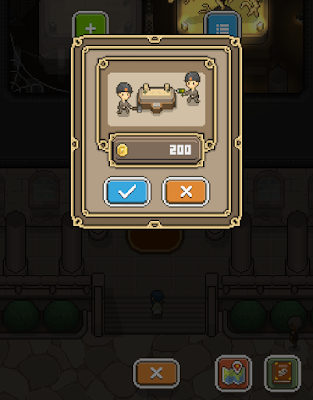
Many of the game menus convey meaning or function without text: One convention that repeats throughout game menus is the Blue Checkmark button for Confirm and the Orange X button for Cancel (Figure 5). The contrast of these colors is clear, and anyone, no matter their color perception, will understand them. In many places, the game grays out buttons that a player can't press at that moment. Similarly, the game changes the text of the Excavation cost to red when a player doesn't have enough gold to afford it. Buttons within the Global Navigation at the bottom clearly convey their contents, such as the Map and the Encyclopedia at the bottom of Figure 5. |
| Figure 5: An example submenu with Confirm and Cancel options |
Minor
The Confim and Cancel buttons don't conform to mobile conventions: Whereas the most prominent buttons in the Default Museum Screen appear in the bottom-right corner of the screen—insinuating that this game is designed for right-handed people and a Western audience—the Confirm and Cancel buttons don't conform to this convention. In every instance where the Confirm and Cancel buttons appear in game menus, the Confirm button sits to the left of the Cancel button (Figure 5). In many other mobile game menus, the opposite is true. Assuming that a majority of players are right-handed, this makes them more likely to accidentally tap the Cancel button with their right thumb.Suggestions: Flip the Confirm and Cancel buttons wherever they appear in game menus. Alternatively, separate the two buttons by moving the Cancel button elsewhere.
Crucial
Too many steps to get in and out of Excavation gameplay: Often, players exit Excavations with less gold than they need to carry on with the next session. They then must tap three Cancel buttons to return to the Museum so they can pick up more gold (Figure 6). From there, it's four buttons to return to the Excavation Confirmation Screen. In a game that is already heavy on tapping, this eight step process (seven buttons plus tapping to pick up gold) risks causing tap fatigue.Suggestions: One option is to make the Cancel Button in the Global Podium Screen always interactive. Alternatively, create a global cancel that would allow players to return to the Default Museum Screen by tapping anywhere outside the menus.
 |
| Figure 6: It takes three Cancel buttons to return to the Default Museum Screen |
Podiums
Great
Player progression is clearly indicated in multiple ways: Players have a clear reference for their progression on a given skeleton because the fossils accumulate on the Podium as they are accrued. The percentage bar is equally useful, as are the names of dinosaurs which players slowly reveal (Figure 7). In the Default Museum Screen, it's clear when a dinosaur is unfinished because the bones don't have the same golden glow as the finished ones. |
| Figure 7: The Podium Progression Screen |
Significant
Players can't manipulate the camera in the Global Podium Screen: Unlike the Default Museum Screen, players cannot manipulate the camera with the swipe of their finger in the Global Podium Screen. This is especially problematic early on in the game when, by default, the camera places the next available podium at the top of the screen (Figure 8). The gap between the Podium Screen Button and the next available podium is therefore almost the length of the entire screen. Players using one hand to play might find this distance physically straining.Suggestions: One option is to allow players to manipulate the camera in the Global Podium Screen. Another option is to focus the camera of this screen on the entire first room of the museum from the beginning of the game onward (i.e. set the camera so the main entrance is at the bottom of the screen).
 |
| Figure 8: Example screenshot of the Global Podium Screen |
Great
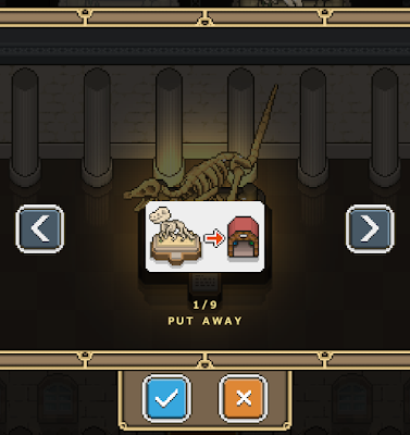
Storing and displaying fossils: The option to Put Away a fossil is the default option when the player opens this screen, making this a quick 2-step process (Figure 9). It is just as easy to swap one dinosaur for another, as well. By default, podiums restrict fossils choices according to difficulty level and size. In other words, players cannot place a Gold skeleton on a Bronze podium. This is good error prevention. |
| Figure 9: The Storage Menu |
Map
Great
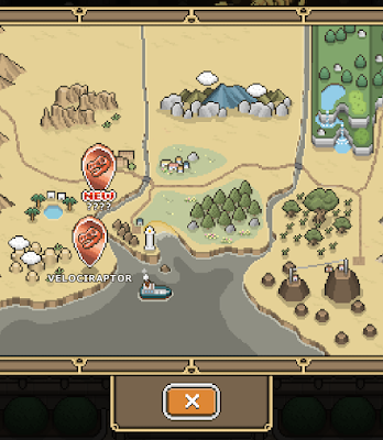
Textual cues help players choose their next Excavation: In addition to the bright red label for NEW beneath newer Excavations, the question marks also contrast against the names of other completed Excavations (Figure 10). Both cues make choosing the next Excavation a quick process. |
| Figure 10: The Map |
Great
Markers use a familiar hierarchy to indicate difficulty: Besides the size of each podium, it is clear that some Excavations are more difficult than others because of the markers on the map. The order of difficulty is bronze, silver, gold, and platinum, which should be a familiar enough convention for any player no matter where they are in the world. Later on, these markers appear in tabs above the Map to separate the difficulties from one another.Item Menu
Significant
The visual cue for item ownership is misleading: When players run out of items, the button turns gray and the color of the number turns red. These are both good cues. Nevertheless, the number does not drop to 0. Instead, players see a red number 1 (Figure 11), and they might assume that they are nearly out of that item instead. This has the potential to mislead or confuse players because it is inconsistent with other menus that represent item inventory.Suggestions: Change the number value to 0 when players run out of items, just as it does in the Excavation Confirmation Screen and elsewhere.
 |
| Figure 11: The Item Menu |
Crucial
It is not obvious that the i button leads players to purchasing items: In order to purchase more in-game items using Gems, players must click on the i button below the Item Icons along the left hand side of the menu (Figure 12). Players might not click on the i button because they might assume that it merely leads to more information. The i button is also quite small and easy to miss. A separate alert that the game uses to draw attention to this button is also just as small.Suggestions: One suggestion is to change the i icon to a + sign. Another suggestion is to move the button itself to the top right corner of each Item Icon, where there is more room to enlarge them. This would make these buttons stand out more to players. Lastly, another option would be to add these purchasing options to the Market menu.
 |
| Figure 12: The alert is just barely visible below the Stamina Drink Icon |
 |
| Figure 13: The Item Purchasing Menu is quite usable itself |
Minor
Players might gloss over repeated text throughout menu: The descriptions of the last three items all begin with, "When excavating...," which adds more clutter to this menu than necessary (Figure 12). As it is, this menu grays out the buttons for these items when the player is inside the Museum. This is a sufficient enough constraint to prevent players from using these items outside of Excavations. Furthermore, players might be less likely to perceive the i buttons with so much information to digest.Suggestions: One suggestion is to cut out those first two words from the last three item descriptions. Another suggestion is to pare down the descriptions where possible. For instance, the description for the Fuel (Bulldozer) item could read, "Digs up a wide area."
Minor
Players could miss the Group Header Icons due to their small size: Items that are meant for the Museum are represented by the Museum Icon, while those items meant for Excavations are represented by a Pickaxe Icon (Figure 12). Players are less likely to register these headers because these icons are smaller than the Item Icons. Therefore, players might not register these headers and rely more on the item descriptions to understand the purpose of the items in each grouping.Suggestions: One suggestion is to make the Header Icons at least as large as the Item Icons. Another option is to add titles beside each Header Icon (eg. put 'Excavations' beside the Pickaxe).
Market Menu
Great
The Market Menu tells players what's for sale with little textual information: This is one of the better menus in the game, where icons and buttons work together in unison to tell players exactly what's for sale (Figure 14). The icons and item quantities are as unambiguous as the dollar values in the blue buttons. Moreover, the names of each pack help players make informed decisions. |
| Figure 14: The Market Menu |
Significant
The dollar amount for the Starter Pack is too small to be legible: Clicking on the Details button in the Market leads players to a description of the Starter Pack (Figure 15). Nevertheless, the dollar amount within the blue button is too small to be legible.Suggestions: Make the dollar amount in the button for $5.99 a legible size, just as other costs appear in the Market Menu.
 |
| Figure 15: The Starter Pack Details Screen |
Upgrade Menu
Great
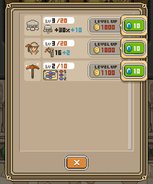
Color coding helps vital information and functionality stand out: The contrast of the blue buttons against the gray ones clearly indicates that one is interactive whereas the other is not (Figure 16). Here, turning the gold requirement to red when a player doesn't have enough funds is a good use of this convention. Similarly, using the color orange to indicate max upgrade levels and the color blue to indicate what players receive from individual upgrades are both good uses of these contrasting colors. |
| Figure 16: The Upgrades Menu |
Minor
There are no textual descriptions for the upgrades: Although players should come to understand what each upgrade does overtime, no text means they are going to have to interpret this menu themselves. The most difficult upgrade to grasp is the second one because the icon of the Miner is not a permanent fixture in the Excavations. Friction this early on could harm player retention over time. Also, players might be less likely to spend their gold here if they don't understand the value of the upgrades.Suggestions: One option would be to add the i button to the Upgrade Icons, leading to a pop-up with a short description of each upgrade. Alternatively, a brief video of the upgrade's impact would be a good substitute for any text. Lastly, making the Miner or the Pickaxe Icon a permanent fixture beside the Excavation Progression Bar in the Excavation Screen could help draw a stronger connection between the two.
Encyclopedia
Minor
The organization of this menu is not transparent: Overall, the buttons and layout on individual pages are quite good. The one flaw is in the organization, in which dinosaurs are ordered according to Difficulty Level. For instance, Silver Level skeletons begin at page 21. Players with only a few Bronze skeletons will therefore have a gap between these skeletons and their higher level counterparts. This could be confusing to players who have unlocked higher level dinosaurs and don't understand how to find them (Figure 17).Suggestions: One suggestion is to organize the skeletons according to the order in which players Excavate them. Alternatively, introduce tabs along the top of the menu that organize the dinosaurs by level (as if they were bookmarks).
 |
| Figure 17: The Page Number is displayed in the top left |
Options Menu
Minor
Text-shadows make some options illegible: Although the first two sections of this menu are clear enough through icon choices, some players might not be able to read the associated labels because of the text-shadows (Figure 18). With no white space between some of the letters, the letters blur into one another.Suggestions: Find another way to make these labels stand out. Whether that's reducing the text-shadow and adding more empty space between the letters, or by removing the text-shadow and underlining the labels.
 |
| Figure 18: The Options Menu |
Crucial
No help available: Without the option for help, players might put down the game when they encounter problems. Players who encounter issues with payments or receiving paid for in-game items would be at an irreconcilable loss without any help.Suggestions: At the very least, add a button that leads players to reporting problems. This is especially significant where it concerns in-game purchases. Additionally, players could benefit from an in-browser FAQ page or, alternatively, a summary of key game concepts.
—
Thank you for reading this post! This game has a lot to offer beyond the first hour as it's represented here. Discovery, customization, and learning all go hand-in-hand with TAP! DIG! MY MUSEUM!
