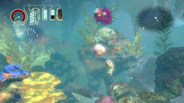
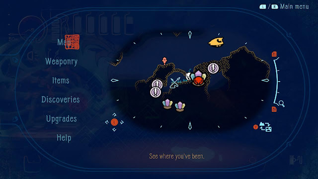
is both aesthetically breathtaking and fun to play. The game includes as many environmental affordances as it does intuitive menus. The HUD and in-game menus, dominated by a light blue palette, use accents of warm colors and input prompts to great effect. A player can propel the Aquanaut through the water, aim their gun, and fire, all within milliseconds using the natural and intuitive controls. Nevertheless, there are some usability issues with the maps, some of the minor in-game menus, and the HUD.
as the lone Aquanaut flees the ever-encroaching ice sheet growing down from the ocean surface. Through a series of obstacles, mazes, and zones, players accrue power ups and weapon upgrades in a structure befitting the metroidvania genre. The farther the Aquanaut dives, the more dangerous the environments and enemies become.
Startup
Great
The Title Menu is dynamic: At initial startup, the Title Menu is quite simple (Figure 1). There are only two buttons: New Game and Options. This helps streamline the process of getting players into the game. Likewise, the background places players in the tutorial zone before they even know that they're in the game. As players progress, they accrue more buttons like Juke Box Mode. So too does the background change (Figure 2).
 |
| Figure 1: Title Menu at initial Startup |
 |
| Figure 2: Title Menu after game completion |
Minor
The first step in the Difficulty Menu doesn't include descriptive information: Players are given two choices for difficulty modes when they begin a new game, Easy and Standard (Figure 3). Nevertheless, the game doesn't give a description of either mode until after a player chooses one and reaches the Difficulty Confirmation Screen (Figure 4). Players therefore have to click on each option to find out more information about either. Then, if they want to go back, the game returns them to the Title Menu. This can slow down the process of getting players into the game. It could also inhibit players from making the best choice for themselves.
Suggestions: Keep the Difficulty Confirmation Screen, but move the descriptive information to the first Difficulty Menu in the space above the options. The text above could change depending on what option has focus, making the menu more dynamic.
 |
| Figure 3: The Difficulty Menu |
 |
| Figure 4: The Difficulty Confirmation Screen |
Tutorial
Great
The tutorial zone, Home, gives players what they need to succeed: The zone is built to ease players into the game, introducing them to one game feature after another in easy-to-digest bites. The game pairs textual instructions with environmental obstacles to create a cohesive introduction. Icons that appear in the Minimap often appear in the instructions, as in Figure 5. Because there is too much to process in the tutorial alone, all the game features will be broken down over the course of this blog post. As is befitting of a metroidvania, the game does add new features over the course of the game, and, thankfully, every upgrade comes with its own introduction.
 |
| Figure 5: Example instruction from the tutorial zone |
Player Status
Great
The Health Bar clearly conveys damage and oxygen levels through visual cues: The Health Bar does a great job of telling players the damage they've taken and how much oxygen they have left (Figure 6). Thin cracks to the tanks give way to a matrix of cracks when the player sustains significant damage. These orange cracks stand out in front of the light blue oxygen level, the oxygen level itself is just as responsive to the player's movements, and the black background clearly conveys a sense of emptiness.
 |
| Figure 6: Example damage and oxygen levels (top-left) |
Significant
The Health Bar does not fully reflect the player's health status: As players accrue tank upgrades, they can carry up to ten oxygen tanks at once. Nevertheless, the tanks disappear from the HUD when they break. Closer to the end of the game, this lack of visual representation forces players to count their tanks when they come across oxygen tanks in the wild. Players might have to ask themselves, "Is it more strategic to pick up the tank for the oxygen if I'm at full tank capacity, or am I below my max capacity as it is?" Five or six tanks might be easy to count, but seven to ten is too much to ask of players.
Suggestions: One option is to make the line above the oxygen tanks permanent. The divots in the line would be intuitive enough to convey whether a player is at full capacity. Alternatively, leave a light gray outline of the tanks when they break.
 |
| Figure 7: After losing a tank, the top line will shrink to the next divot |
Weapons & Tools
Great
Ammunition & Tools make great use of iconic labeling: In the HUD and in the Pause Menu, Ammunition and Tools are represented almost entirely by icons. The weapons could have been especially difficult to differentiate from one another, but the icons are so well designed that they avoid that issue. Each Ammunition icon clearly conveys the behavior of its respective weapon.
Likewise, icons for the Tools do a superb job of conveying their purpose. For instance, players should understand that the icon of a first with an upward arrow inside it will give them a boost while climbing.
As if these icons weren't already intuitive enough, descriptions at the bottom of the Ammunition and Tool Crafting Submenus make explicit what the icons imply.
 |
| Figure 8: No two items in the Weapon Wheel or Tool Pouch look alike |
Minor
The Tool and Ammunition Crafting Tabs use symbols that are too similar to Switch buttons: The Tool Crafting Tab uses a minus symbol for Consume and a plus symbol for Add Item (Figure 9). There
are red input prompts for each control (A and X), but these prompts appear smaller than the plus and minus symbols. Nevertheless, the plus and minus symbols could be confusing to Switch players who are getting acquainted with the menu.
Suggestions: One option is to make the input prompts larger. As for the symbols, these could be changed to carets (^) or the color could be inverted (ie. fill the circle with a light blue color and change the plus and minus symbols to a dark blue color). Either option is dissimilar enough from any Switch button. The solution would have to be implemented in the Ammunition Crafting Tab, too.
Lastly, the labels around the plus and minus symbols for Add Item and Consume could be turned into headers at the top of the tab for clarity.
 |
| Figure 9: The Tool Crafting Tab |
Controls
Great
Aim assist for weapons and leaping off walls put the dual joysticks to effective use: Throughout the game, players use the left joystick to maneuver the Aquanaut and the right joystick to aim. Both versions of the aim assist, for weapons (Figure 10) and for leaping, add visual cues that make it easy to move around in this game environment. The visual cues are also different enough not to be confused with each other.
 |
| Figure 10: The weapon aim assist |
Great
The three HUD menus on the shoulder buttons make use of dynamic design: Holding the left shoulder button opens the Weapon Wheel and Tool Pouch (Figure 8). Holding the right shoulder button opens the Tether Menu, which is also a wheel (Figure 11). Both wheels use red accents to convey the respective controls: an input prompt and arm in the center, and a highlight around the option that has focus. Input prompts over each Tool offer players shortcuts for quick access. Overall, the design and function of these HUD menus make gameplay quite dynamic: a player can jump in the water, use a Tool, and then aim and fire their weapon all within the same second.
 |
| Figure 11: The Tether Menu appears in the bottom-right |
Feedback
Great
Audiovisual cues are well polished during gameplay: The color red is used throughout the game environment to indicate critical information. In no particular order, there is the red line in the ocean that indicates the player's depth boundary, the color red is used for telegraphing enemy attacks, buried objects emit a red glow, and the game uses 'no' symbols in red to convey whether a player can interact with a given object, among many other applications.
Likewise, there are as many distinct sounds as there are in-game events. These include picking up materials, equipping oxygen tanks, mining for materials, telegraphing enemy attacks, and much more.
 |
| Figure 12: Diving near or below the red line turns other parts of the HUD red |
Great
Buttons and levers are designed to look like what they're supposed to do: The many types of buttons and levers throughout the game stand out from the environment in such a way that they are all hard to miss. In many instances, buttons for electronic doors glow red before use and glow green after use (Figure 13). Likewise, the color red is used for the levers and hooks throughout the game to indicate that they are interactable objects. Finally, buttons in the ancient temple are just as obvious to spot (even if they look less advanced than their futuristic counterparts).
 |
| Figure 13: An example button with input prompt |
Great
Progression bars help with error prevention and disruptions: Progression bars that count up include the one associated with mining and the one associated with manual saves. These both have great responsiveness because players can bail at any moment. Likewise, the stamina bar fulfills the same role in reverse. And, even though it isn't represented by a bar, players can tell if they're about to be damaged by ice because it slowly encases the Aquanaut's suit. In all four cases, these bars help players avoid time consuming processes or avoid potential damage.
 |
| Figure 14: The progression bar associated with manually saving |
Upgrades
Great
The Upgrades Menu uses color to convey a hierarchy of important information: Broken up into four horizontal tabs along the top of the menu, each tab within the Upgrades Menu offers important information to players. The color red is used to indicate the most important information, such as input prompts and alerts that tell players when upgrades are available. Red is also used in the Weapons Tab to indicate how an upgrade will improve a weapon's stats. The description, the next most important information, appears in an orange font along the bottom of each submenu. Finally, a light blue color is used for the rest of the menu elements. Required materials stand out because they are the only other splash of color apart from the warm and cool colors that dominate the rest of the menu. Overall, these menus help make upgrade decisions simple and easy.
 |
| Figure 15: The Weapon Upgrade Tab |
Significant
No names associated with in-game items: While the game does such a good job of relaying information through descriptions and icons, it fails to provide players with names of in-game items. This is problematic for players because it prevents them from finding or creating help. Players who want to find help online via walkthroughs will have trouble specifying what they're looking for. Similarly, people who want to create walkthroughs will have to make up their own names for in-game items. This is especially problematic for Upgrade Materials and Key Items, because the game world contains a finite amount of these items.
Suggestions: Give names to in-game items, especially Upgrade Materials and Key Items. The Materials Tab or the Key Items Tab could either display the names below the menu in an orange font or below each icon.
 |
| Figure 16: The Materials Tab |
Map
Great
Icons in the Minimap and Map help players navigate by being distinct: On the Minimap and in the Game Menu counterpart, it is easy to orient oneself to the surrounding icons. For instance, the Crystal Icon represents buried materials, which is different from the same icon with the Aquanaut's face in red superimposed on it. The latter represents a key material for suit upgrades and therefore game progression. Otherwise, icons for the Aquanaut, the Submarine, Save Points, and Fast Travel Points are all distinct enough to aid with player orientation. Icons and input prompts for controls along the borders of the Map encourage use (Figure 17).
 |
| Figure 17: A slice of the Map |
Significant
Players cannot navigate between zones in the Map: Although there is a Macro View of the map (Figure 18), players cannot select different zones to navigate to. This forces players to travel to each zone when they want to look at different portions of the Map. This is especially problematic because players might not know which zone they need to travel to before they begin the travel process.
Suggestions: One option is to allow players to scroll through zones in the current Map, using the shoulder or arrow buttons to navigate (as in a carousel). Another option is to add zones to the current Macro View as selectable nodes. Lastly, one more option is to introduce an intermediary map that portrays the whole map with abstract polygons, as in the macro map in
Hollow Knight.
 |
| Figure 18: The Macro View icons for the player and objectives |
Significant
Players cannot place their own markers: Although the game creates objective markers for players, players themselves cannot place markers on the map. Players who wish to explore uncharted parts of the map must either remember where they are going—putting a heavy strain on their memory—or else they must constantly refer to the Map. In addition, unexplored portions of the Map do not have high contrast against what has been explored (Figure 19).
Suggestions: One option is to allow players to set a limited amount of markers on the Map that then appear on the Minimap. Alternatively, allow players to drop reminders for themselves in the physical game world.
 |
| Figure 19: The Map with large swaths of uncharted areas in black |
Significant
Players might not be able to locate their destination on the Fast Travel Map: In the absence of zone names and zone borders on the map, the Fast Travel Map relies on pictures to tell players where Fast Travel Points are located. Some of the pictures do not convey their respective environment and players could easily get lost while using this menu.
Suggestions: Descriptive labels such as zone names would help players orient themselves to the Travel Points. These could be on the Map itself or below each picture. Another set of underused icons are the banners that appear every time a player enters each zone (Figure 21). These icons could replace the current images or they could be used in place of descriptive labels.
 |
| Figure 20: The complete Fast Travel Map |
 |
| Figure 21: The banner for The Trench zone |
Minor
The Fast Travel Map doesn't represent player position like the standard Map: Instead of an icon of the Aquanaut's mask or the Submarine, the Fast Travel Map uses a red target to indicate which Travel Point a player is traveling from (Figure 20). This Map
does prevent players from selecting the Travel Point at their location, but it forces them to first come to that realization through process of elimination. This inconsistency could confuse players getting acquainted with this menu.
Suggestions: One option is to replace the red target with an icon of the Aquanaut or Submarine. Alternatively, add either icon beside the red target.
Help Menu
Great
The Help Menu contains as much good design as it does useful information: Players can navigate between topics through the tabs along the top. From there, much of the information is expandable, as indicated by the red Carets along the right. Furthermore, the red Crosses along the left indicate which entries are new and yet unread.
 |
| Figure 22: The Help Menu |
Save Menu
Great
Red font in the Save Confirmation Screen helps with error prevention: Using a red font for the Date of Last Save and Time Played help players determine whether they are overwriting the correct file (Figure 23). This could be especially crucial for players who navigate through these screens quickly.
 |
| Figure 23: The Save Confirmation Screen |
Options Menu
Great
Usability conventions in the Options Menu borrow from gameplay menus while offering a wide breadth of customization: It's always clear when an element in these menus has focus because that element is highlighted light blue and/or it gains a light blue border. Some menus also convey player selections through red highlights, as in the Language Menu (Figure 24). Furthermore, Input Prompts, Sound, Controls, and Language are all customizable, a testament to the flexibility of this game.
 |
| Figure 24: In this image, Canadian French has focus, while American English is the current selection |
Minor
Some players might not find the Options menu: It takes a total of four steps to get to the Options Menu in-game. That also means that any submenu within the Options Menu is five steps removed from gameplay, including the Achievements. This is because the game nests the Secondary Game Menu (Figure 25) within the standard Game Menu. Players must hit either shoulder button in the Game Menu to get to the Secondary Game menu. Players might be less likely to find or use the Options, especially if they miss the small cue in the Game Menu.
Suggestions: Separate the Secondary Pause Menu and map it to the (-) button on the Switch controller, which is currently unused in gameplay. Alternatively, make the cue for the Secondary Game Menu more obvious either by enlarging it or using a warmer color.
 |
| Figure 25: The Secondary Game Menu |
Minor
The background bubbles make parts of the Options Menu unreadable in the Title Screen version: It is much more difficult to read the Options Menu in the Title Screen version of the Options Menu because the bubbles are too similar in color and opacity to the labels (Figure 26). It makes it even more difficult to read the menu options because the bubbles float behind the elements. Therefore, these menus might be illegible to some players.
Suggestions: One option is to make the bubbles more transparent. The menu would be even more usable if the bubbles didn't float behind the menu options at all.
 |
| Figure 26: Background bubbles interfere with the readability of the Options Menu |
—
Thank you for reading! I quite enjoyed this game and I highly recommend diving into the world of Shinsekai: Into the Depths. It's a title that definitely does justice to its genre.


