Overview
A popular mobile game by any measure, CSR Classics does a lot right with usability. Most of the menus are intuitive and dynamic, but there are some inconsistencies in labeling and a few features ignore conventional wisdom. The tutorials do a great job bringing players into the game, even if some of the wording is vague. Overall, signs and feedback are used to great effect throughout the game.
The core loop of the game pits players against a series of increasingly difficult race crews in one drag race after another. Other race modes (excluding the now discontinued online races) are there to add variety. Refurbishing classic cars is as much a central component of the game, too. I would not normally review a game as old as this, but it was assigned to me by a prospective employer.
Platform (Played on): Mobile (Android)
Revenue Model: F2P
Revenue Model: F2P
Released: 2013
Developer(s): Boss Alien, Mad Atom Games
Publisher(s): NaturalMotion Games
Startup
Significant
No sign for where to begin: When a player opens the game for the first time, it is unclear where they go to begin the game (Figure 1). Players who are used to reading from left to right might avoid the bottom navigation because the label for My Profile is grayed out. Although the correct pathway is through the Next button, players might also assume that button merely toggles the menu options.
Suggestions: Highlight the label of the Next button with a bright orange color that pulses in and out. Players will be more likely to catch the color and motion, thereby leading them to the tutorial. Alternatively, force the Agent character pop-up to appear and bring the player into the tutorial as soon as the Home Dashboard loads.
Suggestions: Highlight the label of the Next button with a bright orange color that pulses in and out. Players will be more likely to catch the color and motion, thereby leading them to the tutorial. Alternatively, force the Agent character pop-up to appear and bring the player into the tutorial as soon as the Home Dashboard loads.
 |
| Figure 1: The Home Dashboard on startup |
Tutorial
Great
In-game tutorials are a fitting introduction to the game: Through a series of pop-ups and dialog bubbles (Figure 2), the game does a great job of teaching players what's important. For instance, players learn racing mechanics before they race against competitors. They learn the contents of sub-menus through performing tasks (eg. buying a car or adding a decal). The game also gives players the opportunity to learn about and experience each race mode one at a time. Nevertheless, there are some areas that could use improvement.
Players might miss the most important information on the last line: On top of the sheer length, the part related to the green dash light appears at the end (Figure 3). Players are more likely to skip these lengthy instructions and therefore miss that critical information.
Suggestions: Rephrase the instructions to, "When the dash light is GREEN, tap here to SHIFT UP." Players will be more likely to associate the word green with shifting that much quicker. Alternatively, remove the second sentence or place it at the end of the dialog bubble.
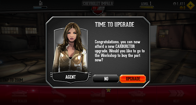
The upgrade tutorial never ends: Although the Workshop tutorial is quite effective overall, the upgrade portion never ends. Every time a player can afford the next available upgrade, the Agent pop-up appears (Figure 4) and suggests purchasing that upgrade. This pop-up forces players to interact with it, whether they want the upgrade or not, and adds one more click in between the player and getting back into the game.
Suggestions: One option is to remove this feature altogether and leave the upgrade tutorial as a one-time event. Another option is to give players the choice to keep showing these pop-ups or not. A checkbox that reads, "Do not show these messages again," could give players more agency here. Lastly, the Upgrade Menu in the Global Navigation could employ an icon like the yellow star to alert players to newly affordable upgrades.
Additionally, all the right details are there in the soundscape: the engine revving, the initial countdown, and the sound of the tires spinning. The audio cues that accompany shifting are each distinct enough to tell a player how good their shift was. Likewise, the game plays distinct music when a player wins or loses a race.
Suggestions: Change the background color of the Restart and Quit buttons to something more neutral. The orange Resume button would then standout as the natural focal point. Players will still be able to tell Restart apart from Quit because of the icon. Alternatively, add appropriate icons to each button that communicates their meaning.
 |
| Figure 2: An example dialog bubble during tutorial |
Minor
Suggestions: Rephrase the instructions to, "When the dash light is GREEN, tap here to SHIFT UP." Players will be more likely to associate the word green with shifting that much quicker. Alternatively, remove the second sentence or place it at the end of the dialog bubble.
 |
| Figure 3: The first shift instructions |
Significant
Suggestions: One option is to remove this feature altogether and leave the upgrade tutorial as a one-time event. Another option is to give players the choice to keep showing these pop-ups or not. A checkbox that reads, "Do not show these messages again," could give players more agency here. Lastly, the Upgrade Menu in the Global Navigation could employ an icon like the yellow star to alert players to newly affordable upgrades.
 |
| Figure 4: The Agent popup for upgrades |
Racing
Great
The HUD within the racing gameplay conveys all vital information simply: In the top banner, the progression bar serves as a useful tool that supplements the cars onscreen. No pixels are wasted on the Race Time counter, the RPM Gauge, nor the Speedometer. The minimalist car dashboard at the bottom of the screen lends itself to the simple, yet precise game mechanics. See Figure 5 below.Great
Audiovisual feedback is especially polished during races: The green color of the SHIFT NOW cue contrasts well against the preliminary cue in white, GET READY (Figure 5). It's clear that a player is too late to shift when the font color for SHIFT NOW changes to red. Feedback at the top of the screen, such as GOOD SHIFT, helps players understand their performance beat by beat.Additionally, all the right details are there in the soundscape: the engine revving, the initial countdown, and the sound of the tires spinning. The audio cues that accompany shifting are each distinct enough to tell a player how good their shift was. Likewise, the game plays distinct music when a player wins or loses a race.
 |
| Figure 5: The racing HUD with visual feedback |
Minor
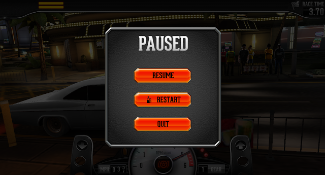
Players could be prone to error due to uniform Pause Menu options: Without the advantage of a focal cue (as in console game menus), players might always have to think about which option to choose from in the Pause Menu due to their uniformity in appearance (Figure 6). Players are also more likely to hit the wrong button if they're moving too fast.Suggestions: Change the background color of the Restart and Quit buttons to something more neutral. The orange Resume button would then standout as the natural focal point. Players will still be able to tell Restart apart from Quit because of the icon. Alternatively, add appropriate icons to each button that communicates their meaning.
 |
| Figure 6: The racing Pause Menu |
Workshop
Minor
Inconsistent label formatting: The TAP TO ZOOM label breaks away from the convention of similar labels, which often appear in the center of the screen in white font. Assuming that players would be more familiar with this convention, they might not consciously register this label in the bottom-left corner of the Workshop (Figure 7).Suggestions: Change the label formatting to fit with the convention. Alternatively, change the font to white but leave it where it is. In either case, this visual cue might serve as a better reminder that this feature exists.
 |
| Figure 7: The Tap to Zoom instructions are lost in the shadows in the bottom-left |
Minor
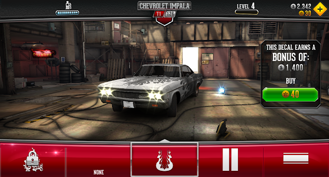
Suggestions: Either gray out the decals that a player doesn't own, or add an icon comparable to the padlock that communicates lack of ownership.
 |
| Figure 8: The Decal Menu |
Map Menu
Great
The Map's geographical layout makes for an effective use of space: Orange arrows appear beside the icons when a player taps on each one (Figure 9). On the right, a short description and the difficulty gauge help players choose which mode is the most appropriate for them. The orange button for Go Race in the bottom-right is a natural focal point. Furthermore, the dots along the bottom are an intuitive way to convey that there are multiple tiers to swipe through.
Navigation
Significant
The default screen mode uses game UI and device UI interchangeably: While it's convenient that the forward and back buttons sit beside each other onscreen in the default screen mode, using the device UI to navigate out of in-game menus poses at least two issues. First, players might accidentally hit one of the other two buttons in the device UI and minimize the game. This is especially problematic if players are in the middle of a task. Second, players might also perceive the device UI as an unconscious reminder that the rest of their phone apps are one click away.
Suggestions: Set the default screen mode to full screen, thus decreasing the chance that players close the game by accident or on purpose. Alternatively, teach players that the option to change screen modes exists.
Suggestions: Set the default screen mode to full screen, thus decreasing the chance that players close the game by accident or on purpose. Alternatively, teach players that the option to change screen modes exists.
 |
| Figure 10: The default screen mode |
Great
Menus make good use of iconic and descriptive labeling: From the top-most menus to the bottom-most ones, in-game menus make effective use of iconic and descriptive labeling that convey their contents. The design makes these menus intuitive, usable, and useful (Figure 11).Race Results
Significant
Players might not be able to parse information from the Result Table: In the bottom-left of the Race Results Screen, there is no border that separates the y-axis labels of the Race Results Table from the data itself (Figure 12). Furthermore, the background colors do not contrast well enough to make the columns between You and the Rival separate. Both these factors could make this table illegible to some.Suggestions: Separate the y-axis labels from the data with a border. Additionally, either increase the contrast in background colors between You and Rival, or put a faint border down the middle that clearly separates the two columns.
 |
| Figure 12: The Race Results Screen |
Garage
Significant
The color of the sorting buttons doesn't contrast well against the background: While the sorting options in this menu are useful, the sorting buttons blend into the background (Figure 13). This is a potential issue to players who already have trouble perceiving low contrast.
Suggestions: Adopt a color scheme for these buttons that would help them stand out more. Whether that's adding more white to the existing color, or adopting the orange/red scheme from the Loved/Unloved buttons in the dealership, all players will benefit from being able to see these buttons easier.
 |
| Figure 13: The Garage Menu |
Dealership
Minor
The orange and yellow colors in the Car Stats Graph don't contrast well against each other: Although the rest of the Dealership Menu is quite usable, the Car Stats Graph suffers from poor color choice (Figure 14). Orange and yellow are colors that people with colorblindness could perceive as too similar. This issue is repeated in the Upgrade Menu in the Workshop.
Suggestions: Instead of orange, use a neutral color like a light gray for the base statistics.
Dollar Purchasing Menu
Critical
Players might not perceive difference between In-Game currency and real money: The icon for in-game dollars is distinct from the real dollar sign, but the two values share the same font and color in the Dollar Purchasing Menu (Figure 15). This could inhibit the purchasing process for players who don't understand the difference.Suggestions: One option is to adopt the teal font color for in-game dollars as it's used in the Workshop when purchasing upgrades. Alternatively, add the currency after the real dollar values (eg. $4.99 USD). In the Gold Purchasing Menu, the same suggestions could be adopted within its own context.
 |
| Figure 15: The Dollar Currency Menu |
Options Menu
Minor
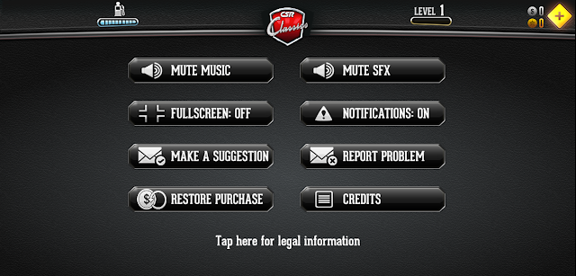
There is no Help documentation: Although this game covers its most important bases for Help—Problem Reporting and Purchasing—there is no Help documentation inside or outside the game (Figure 16). This could impede players who do need the Help and cannot find it. For instance, players who walk away from the game for a long period of time only to come back and realize they can't remember everything.Suggestions: Include a Help Menu with basic controls, mechanics, and descriptions. Additionally or alternatively, add a section with frequently-asked-questions. If this can't be accomplished in-game, a link to in-browser documentation would still be useful.
 |
| Figure 16: The Options Menu |
—
Thank you for reading! If you like racing games, check out their latest: CSR Racing 2.


